Observe the blue graph below. It looks like Planet Earth is going to soon burn up. Oh My Dog!!! We're all gonna die!!! Hey, wait a minute. Zoom-in on the lowest part of that graph. It looks like a trough. It looks like a valley. It represents the years 1908 to 1912 ... approximately. Well, according to the graph below, the coldest years since 1880 were 1910, 1911, and 1912.
There is a humongous mistake on the part of the people who altered the previous temperature "anomaly" graph, and replaced it with this one here. And what is the big problem instantly seen by anyone who has even the slightest education in weather history???
ANS: The Year 1911 was the Year of epic & tragic heat wave activity, while 1910 was reported as having been "extraordinarily hot."
In fact, there did occur the Great Fire of 1910 in Northwestern America. Thus, there is no way that 1910 & 1911 are the second and third coldest years in the past 146 years. (1880 to 2026 = 146 years. 1880 is the starting point of the graph below, at the x-axis.)
As a quick example, the only time in Fargo North Dakota history when the temperature reached 80F during March was in March of 1910.
Let's go step by step, here. The first step is to know what "anomaly" means. It means incremental change ... step by step change ... unit by unit change upward or downward.
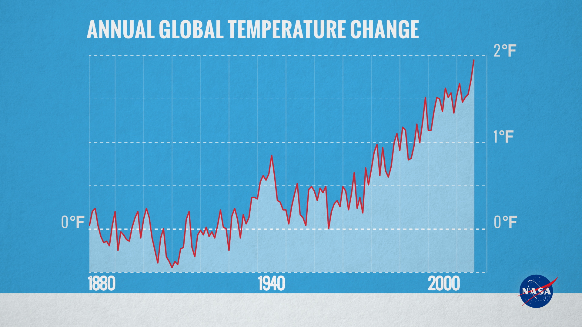
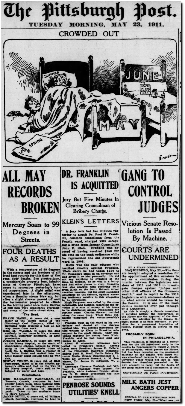
⇑⇑⇑ Look upward, into that graph's lowest points. It's 1910 & 1911. Next: Look at the 1910 & 1911 newspaper articles below that reported on extreme heat.
Concerning the drastic upward slope of this temperature "anomaly" graph, it's a simple numbers-game illusion. Look at the vertical line, aka the Y-Axis. The smaller the amount of numbers on the Y-axis of any graph means that the appearance of incline or decline will be overly pronounced. The smaller the number of grid-lines means the more severe is the degree of change. And such a thing is always deceptive.
Moreover, that chart only reports on the degrees of change of temperature. It doesn't report the actual Fahrenheit temperatures of the time. Such a thing is a great way to deceive novices --- laymen --- the untrained public.
Now, the blue graph above is certainly fraudulent in its claim of temperature change, concerning the Years 1910 and 1911, for sure. The 1911 heat wave was extremely ferocious in heat. And the great lesson taught through it is that there is NO CORRELATION between co2 levels and temperature change.
In 1911, the atmospheric co2 level was 300 parts per million. That amounts to 131 ppm LOWER than today.
Now, despite the low co2 level of 1911, 41,000+ people died from the July heat of that year, in France alone. In addition, 1911 England had a brutal heat wave. The one in 2022 didn't compare to it. The one in 2022 was chump change, in comparison to the one in 1911.
And of course, the London Fire Brigade already reported, in 2014, that London Area fires DECREASED by almost one-half of what they were in the 1980s & 1990s. In fact, 2021 was the year of the least number of London Area fires, all occurring when the co2 level was as high as it was in 2022.
~ ~ ~
Of course, there was a cold November in the same Year of 1911, as well as a cold January in 1912. That partially offsets some of the deadly and tragic heat of May and then July of 1911. However, Feb 1912 was not exceptional in cold temperatures, at all. This means that there is no way that temperatures dropped 0.5F in a consecutive three year span.
In fact, take a look at a short 2015 report issued by AG Weekly, concerning the Year 1910. Such reports are written for personnel who don't have the time to sit and read tomes. Things are presented "to the point." So, it's a really brief and educational piece of reading material.
See: Weather Talk: 1910; A Hot Year; Extraordinarily Hot
At the most, the Year 1911 would have "broken even," with record Winter Cold and Record Summer Heat cancelling each other out, and having the temperature-change equal Zero degrees Fahrenheit.
None the less, 1910 was a heated year, on its own. Yet, the newer government graph posted above falsely claims that there was a significant drop of temperature during the general time span of 1909 to 1912. No way. So, a question remains: How long will the United States government continue to lie to its people?
In graph-making, there is something called, "smoothing", where you delete the jagged parts of a graph. It's simply a matter of "rounding off the edges," so to speak. This means that you can erase extreme temps, wherever convenient for you. Thus, a record-breaking heat-wave or cold-wave can magically vanish during graph "reconstruction," thereby making the years represented seem mildly harmless.
Where there's smoke, there is fire. Where there's one falsehood on a graph, there are others.
There are other years on the blue graph below which can be addressed as fraudulent, also. But, I don't get compensated as much as a penny to undo the fraud being done by the usual suspects --- who happen to be highly paid suspects. Such a thing will take time to do --- if there's ever time to do so.
None the less, a table of the raw temperature data is far more honest than a "smoothed" graph, especially when the graph looks jagged in appearance. Cute trick there. But, it's still an insult to the intelligence of any honest person who studied atmospheric science --- or weather history.
In as much, this post and numerous other ones show that Sigourney Weaver outright lied during the 2016 Democratic National Convention, when she claimed that mankind never saw such catastrophic weather events as the ones which occurred after atmospheric co2 rose above 400 ppm. There were much worse & more catastrophic weather events decades and centuries prior, when co2 levels were 320, 300, and 280 parts per million.
Ex-Governor Cuomo said the same thing as did the Sigourney Weaver who now has no credibility. He was proven to be a liar, just as much.
Let's go to the graph of gray & black, located directly below. It's the actual "raw data" temperature graph of 1880 to 2015. The X-Axis begins at zero, making this an honest graph. Actually, it begins at MINUS 10 degrees Fahrenheit. Thus, the X-axis increments are plentiful. Thus, there is proportionality in the viewpoint of the graph, as opposed to a distorted clown show that make every novice assume that the world is coming to an end "in 12 years." The truth is that, if mankind doesn't nuke itself into extinction, the next 12 years will be one of a greening earth, due to the power of photosynthesis carried by the co2 molecule.
 |
| Okay folks. Here's your "end-of-the-world" "Global Warming," I mean "Climate Change." |
And voila. There's your insignificant & non-crisis temperature
rise, since 1880. This is why the typical outdoor working man of the
past 20, 25, and 30 years always says that the "Claim of a Climate Crisis, with no time left to spare," is total
bull crap, squared and cubed.
And of course, if you have a problem with the outdoor
working man, call one via telephone, arrange to meet him somewhere, and
you can tell him to his face that he's wrong. And you can even mock
him, to his face ... like you do from a distance, with Dr. Will Happer, the
late Dr. Tim Ball, Meteorologist Anthony Watts, electrical engineer & computer scientist & geologist Tony Heller, Dr. Roy Spencer, etc, etc, etc.
By the way, it's the working man who kept you safe, warm, and fed throughout the years. Elves did not do those smooth roads & guardrails upon where you safely travel. Nor did elves build those elevators you smoothly ascend and descend, by merely pressing a button. Your ingratitude and pseudo-intellectual arrogance is not appreciated.
All in all, if the charts and graphs do not match the newspaper and magazine reports of the times represented on those charts & graphs, then you have yourself one fraudulent chart ... or graph.
 |
| Just so that you'll know: This photo is of THREE news articles of the time (July 1911) |


| The West Coast fires of recent were nothing new. |

